
06/18
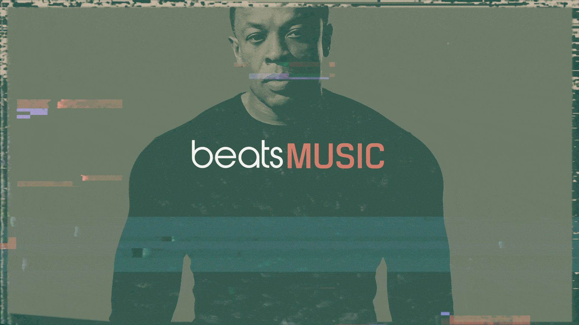
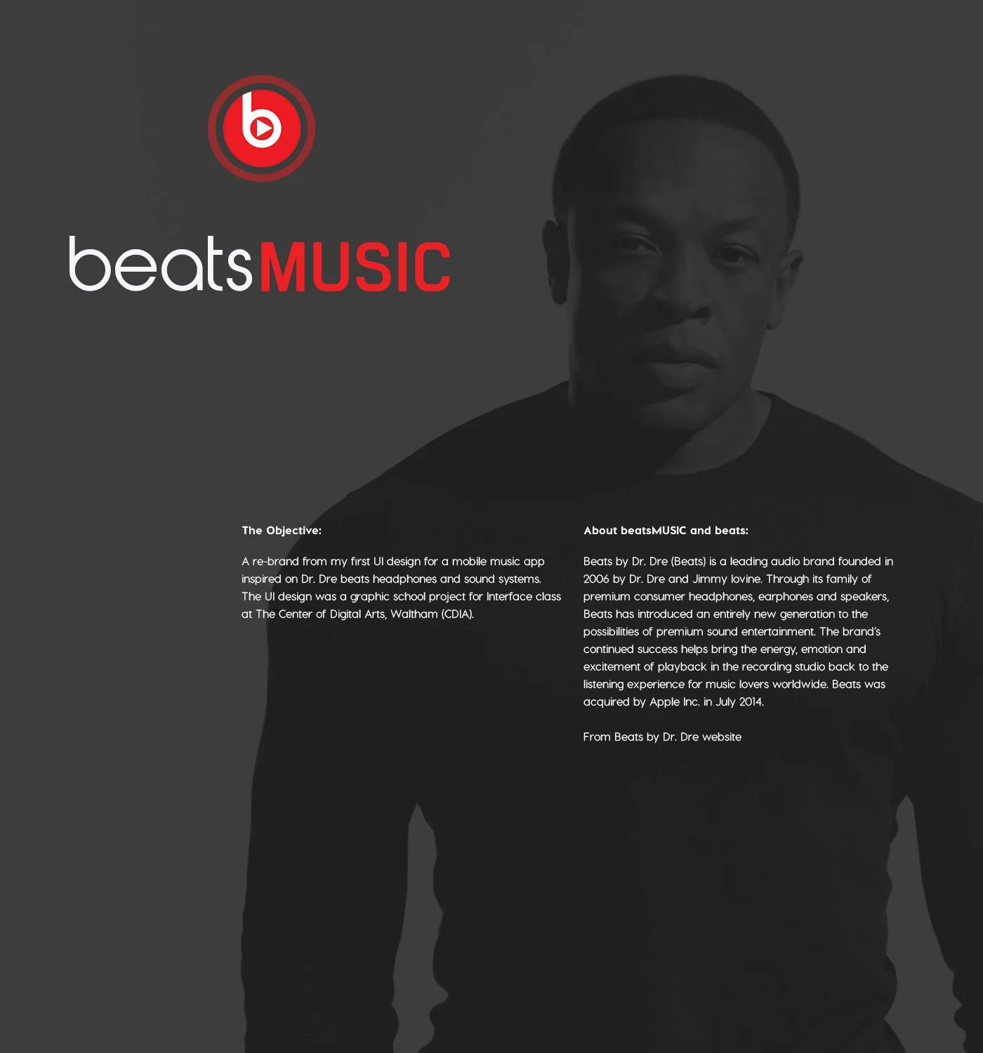
beats MUSIC
The Objective: A Music App Cool for Humanity
An update and re-brand from my first UI Design project for a music app and store inspired on Dr. Dre Beats headphones and sound systems. The Visual and UI design was a graphic school project and portfolio piece for a course taught at Boston University College of Communications Center of Digital Arts in Waltham, MA.
ABOUT BEATS
Beats by Dr. Dre is a leading audio brand founded in 2006 by Dre and Jimmy Iovine. Through its family of premium consumer headphones, earphones and speakers, Beats has introduce an entirely new generation of possibilities of premium sound entertainment. The brand’s continued success helps bring the energy, emotion and excitement of playback in the recording studio to the listening experience for music lovers worldwide. Beats was acquired
by Apple in 2014.
From Beats by Dr. Dre website (2018)
Tools: Adobe XD, Adobe Photoshop
Research & Wireframes
The Challenge:
For this project I wanted to do research and find some ideas to start developing the UI and visual design for the music app inspired by the Beats headphones brand. I need to take a closer look about other music streamers apps work like Apple Music, Spotify and Tidal. I want to consider the problems that the application can have now, simplify navigation through playlists and flow of information. Also it has to develop functionality to check on music trends. One important task is to make the paid version more attractive to users.
Context:
Visual Design & User Interface for the best music service humanity can afford from a parallel universe. The brand closes almost all user need, related to listening to music. You in the parallel universe right now listen to the playlist on the beats MUSIC app. The application allows easy navigation through the different screens. In the paid account, user can download songs and rewind tracks. In the next version for Web 3.0 I am planning to realize transfer of consciousness to the app…
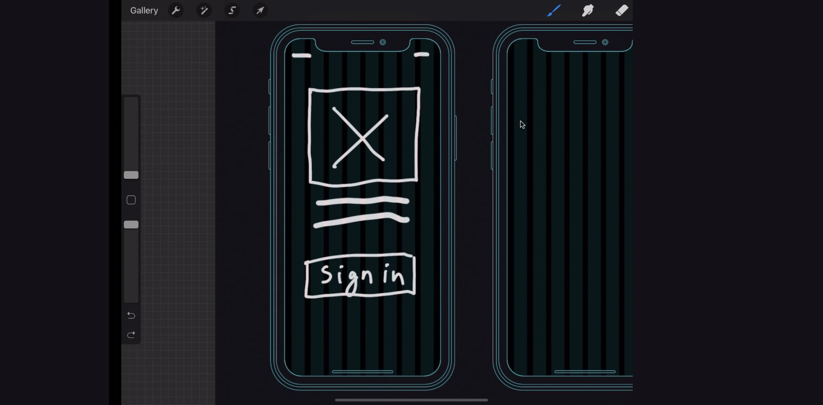
Screen shot wireframing the ui design inside balsamiq
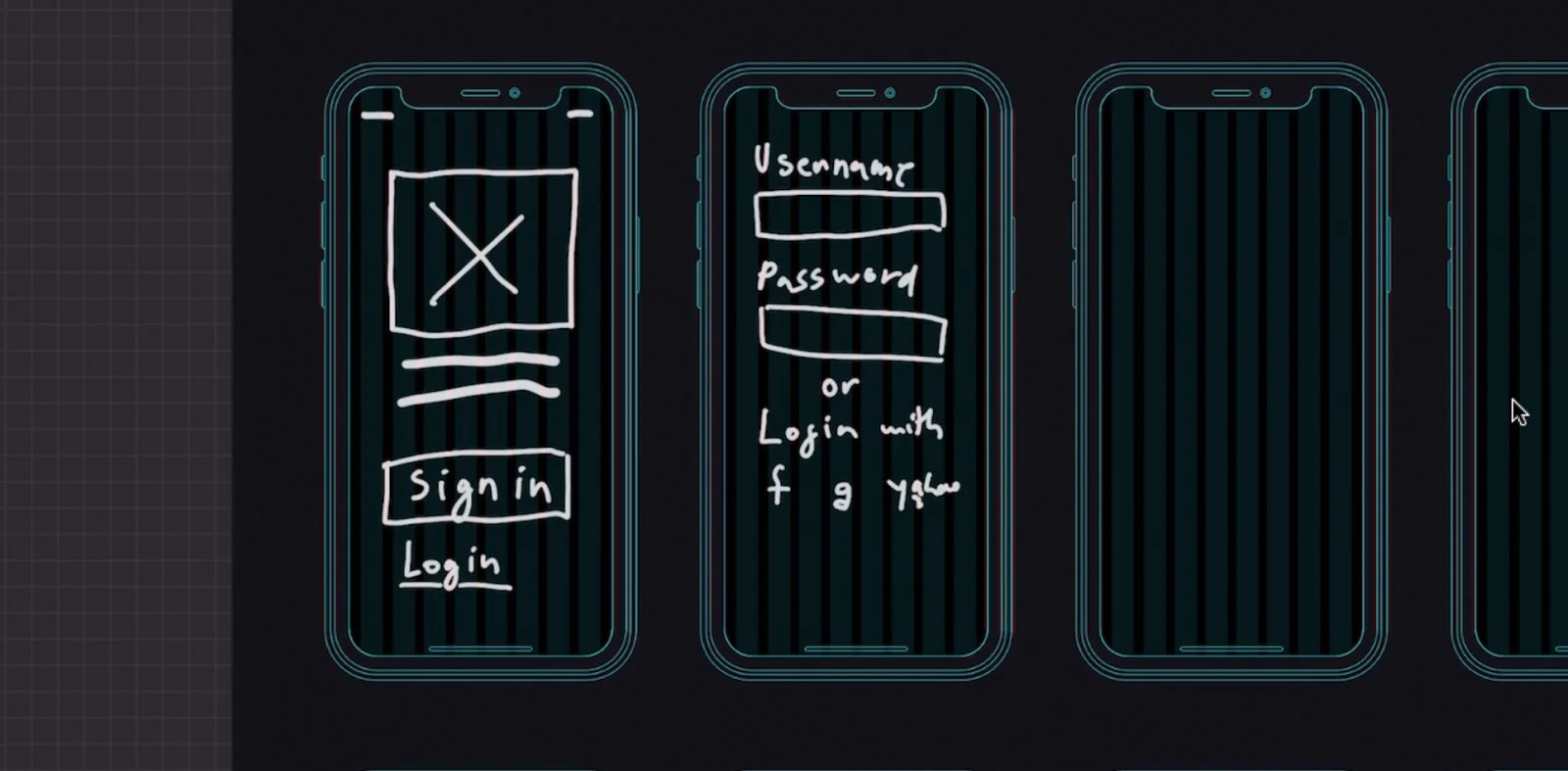
Screenshot of a wireframing a sign in and log in UI design inside Balsamiq
Working on the Design System
I started working on a simple design system that included the Beats Headphones brand colorway. I also included a favorite font from graphic designer Connary Fagen called Visby for the all typography (2015).
Update:
For 2018-19 I made some updates to the project to include more accent colors to the music app and setting the font to Apple’s SF Display more familiar to an iOS system app.
Visual & UI Design - beats MUSIC
Based on the high fidelity wireframes I started to conceptualize the UI screens for the music platform. The idea about the design was to develop a usable, consistent, and organize system, that allow the user to easily found music and podcast. Bringing the ultimate sound experience to everyone: cool for humanity.